
This topic is split into three parts:
Part 1: Introduction to space, positive and negative space
Part 2: Two and three-dimensional space, ground (foreground, middle ground and background)
Part 3: Perspective, rule of thirds, golden ratio
Perspective
Till now, in the first two parts of this series, we have looked at space in terms of positive and negative space, two and three dimensional space, as well as different grounds. In this last part of this series, let us look at more tools employed by visual practitioners to show space in their work.
Perspective is once again related to depth and space, as well as foreground and background. Using perspective, especially in art works that are rendered on two-dimensional surfaces, helps create an illusion of space. Typically, there are three kinds of perspectives: one-point, two-point and three-point. In this blog post, we will look at one-point and two-point. To know more about the basics of perspective drawing, you can check out this link. We will now move on to understanding the usage of these in art and photography examples.
One-point perspective is when all lines in an image meet at a single ‘vanishing point’ on the horizon line. In a painting that employs one-point perspective, all lines can be seen converging at a single point on the horizon line. Both artworks below, by Chakravorty and Baij respectively, have been composed in the one-point perspective format, where all lines (especially evident in the street lines) seem to converge at a single-point. The only difference between the two is the position of the vanishing point on the horizon.
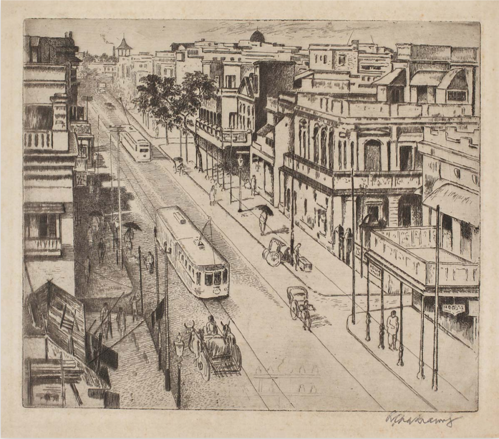

Left: Ramendranath Chakravorty, Untitled (Street in Calcutta) (1930s), etching (source: DAG World).
Right: Ramkinkar Baij, Palam (1958), watercolour on paper (source: DAG World).
Even though is not as evident that one-point perspective has been used to create a sense of depth in Ramkinkar Baij’s work, on careful observation, all lines do meet a single vanishing point, therefore placing this work of art within the frames of one-point perspective.
Sujatro Ghosh’s street scene below is another classic example of the one-point perspective. Compare his composition with that of Chakravorty’s above. While both have very distinct diagonals running towards a single vanishing point, the position of the horizon line makes a drastic difference in the overall composition. The high horizon line in Chakravorty’s lends a larger area for the street, almost making it appear as if it is viewed from a tall building. Ghosh’s horizon line is kind of in the middle of the frame, making us all stand on the ground while looking at the street.
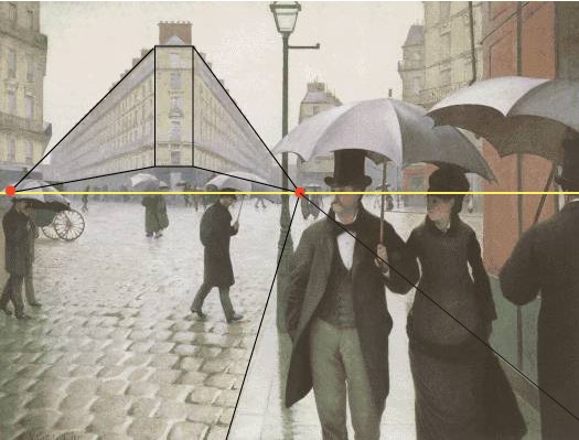
Two-point perspective is when lines appear to meet at two vanishing points on the horizon line. In works that are painted or drawn using perspective, objects closer to the viewer are bigger and objects further away are smaller. This adds to the entire illusion of depth on a two-dimensional surface. Look at the painting below by Gustave Caillebotte. The horizon line is indicated in yellow, with the two vanishing points in red. Notice how the front of the building in the background appears bigger (because it is closer to us) and the two sides are foreshortened dramatically to converge at the two points on the horizon. The pavement on the foreground (which has the two pedestrians) seems to converge at one of the vanishing points in a one-point perspective. In that manner, all lines on the image converge at either of the two vanishing points.
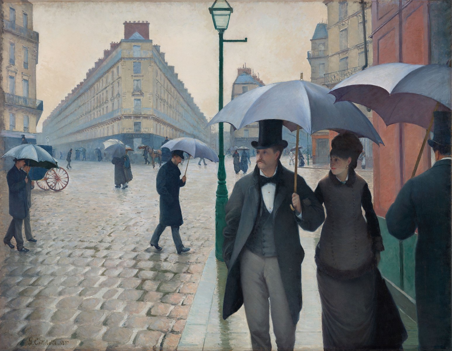
Left: Gustave Caillebotte, Paris Street; Rainy Day (1877), oil on canvas (source: Wikimedia Commons).
Right: Perspective lines marked out (source: Beginner’s School).
TRY IT YOURSELF
Take a photograph of a landscape. Trace all the lines to see if they converge at one point or more than one point. Identify whether your photo is one point perspective or two point perspective.
Rule of Thirds
Rule of Thirds is quite commonly used in photography and film today. But before photography even came to be, it was used in art work to help create better and more striking compositions. What is the Rule of Thirds? It is a general guideline that advises that any image should be divided into a grid with two vertical and two horizontal lines. This will create nine boxes, all of the same size. The Rule of Thirds states that to make an image visually appealing, important elements of the image should be placed either on the lines or at the points where they intersect.
S Elayaraja, Waiting, oil on canvas (source: Art Zolo)
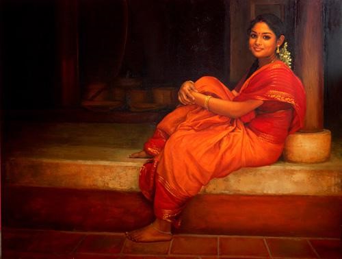
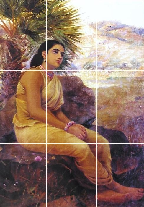
In S Elayaraja’s work (above), the female figure is placed on the right. Her face lies within one box of the 3 X 3 grid. Her seated posture sweeps across three squares and intersections. Elayaraja has thus used the Rule of Thirds to create a striking composition with harmony and balance. Similarly, Raja Ravi Varma’s work (below) also uses the Rule of Thirds. In this work, the woman is seated on the left. Her head is at the intersection of the grid while her arms and legs rest across the other grid squares.

Raja Ravi Varma, Shakuntala (1901), oil on canvas (source: Wikimedia Commons).
Look out for frames that make use of the Rule of Thirds. You can find it very often in movies. Can you see the imaginary grid in the photograph below? The Rule of Thirds really does add to the visual interest of the flat-lay composition.
The Golden Ratio
The Golden Ratio is another compositional technique, used to make images and designs aesthetically pleasing. The balance that the Golden Ratio creates is considered one of the most harmonious balances and the most appealing to humans. It is commonly found in nature among shells, leaves, flowers and even cyclones!
Essentially, the Golden Ratio is a mathematical equation or ratio where a line is divided into two parts and the longer part (let’s call this ‘a’) divided by the smaller part (let’s call this ‘b’) is equal to the sum of a and b divided by a, and both are equal to the number 1.618: a/b = (a+b)/a = 1.618.
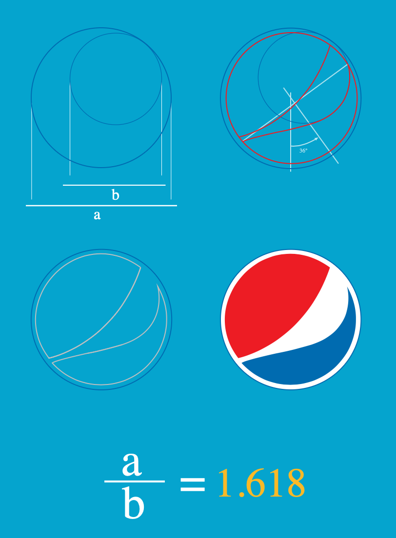
Apparently, the human brain is wired to automatically love images or objects or architecture which uses the Golden Ratio. It is a subconscious aesthetic choice that our brains take and we are automatically attracted to this mathematical ratio applied in real life. The Pyraminds of Giza, Leonardo da Vinci’s work, the logo of Pepsi–all use the Golden Ratio! While it might be time-consuming to try and apply this concept in your work, it is important to be aware of it. Read more about it here.

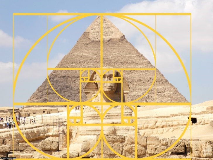
Left: Leonardo da Vinci, Mona Lisa (1503-1506), oil on poplar panel – making use of the Golden Ratio (source: Flickr). Right: The Pyramids of Giza also fitting into the Golden Ratio (source: Research Gate).
TRY IT YOURSELF
Take photos of nature– like seashells, leaves and flowers. Try and see if you can identify the golden ratio in these natural forms.
Hope you enjoyed reading through this blog series about space and composition! Have you checked out our three-part series on colour theory? #VisualVocabWithCPB.