This topic is split into three parts:
Part 1: Introduction to space, positive and negative space
Part 2: Two and three-dimensional space, ground (foreground, middle ground and background)
Part 3: Perspective, rule of thirds, golden ratio
Two and Three-Dimensional Space
In the first part of this blog series, we looked at positive and negative space and how the interaction between the two can impact a composition. However, positive and negative space only make up a small part of space vocabulary. Since space is essentially depth, isn’t all space three-dimensional? In the real world, this perhaps holds true. However, in art and compositions, three-dimensional space is an illusion of space created on a two-dimensional or flat surface. Artists use many techniques to achieve this illusion like perspective, light, shadow and even colour (remember how we spoke about warm colours advancing and cool colours receding?). Sometimes, artists may even choose to embrace the flatness of the canvas instead, thereby maintaining the two-dimensionality of the painted surface.
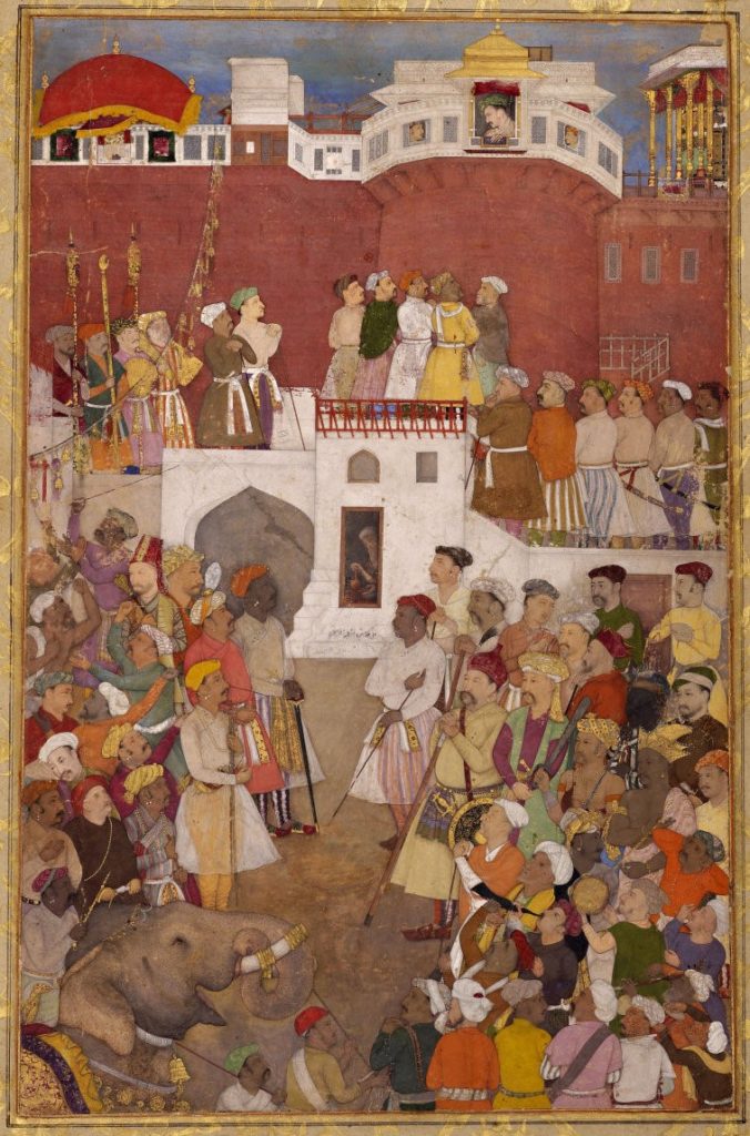
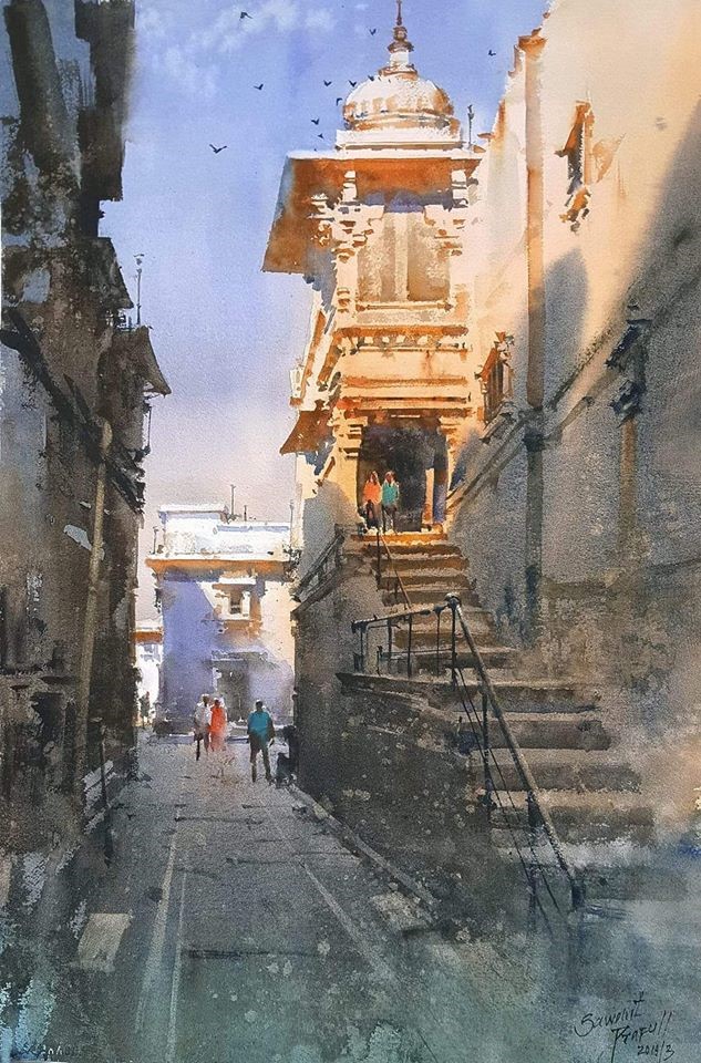
Left: Abu’l Hasan, Emperor Jahangir at the Jharoka window of the Agra Fort (1620). (source: Wikimedia Commons). Right: A Prafull Sawant watercolour (source: Reddit).
Look at the Mughal miniature on the left and compare it to the watercolour by Prafull Sawant. Both have architectural elements and human figures in a street-like scene. In the miniature, three-dimensional space, while evident, is not an illusion in the same way Sawant’s work is. Indian miniature paintings employ a unique kind of ‘multiple perspective’ wherein different objects on the painting are rendered from various viewpoints within the same composition. This is a unique exception to how two or three-dimensional space is typically rendered. In Sawant’s work on the other hand, while seeming to be a watercolour impression, the three-dimensionality is obvious.
Now, let’s look at a couple of photographs and try to identify the kind of space in them: two or three-dimensional. Both examples below have some objects laid out on a flat surface, but the angle from which it is shot makes all the difference. ‘Flatlay’ is a very popular style of photography at the moment wherein objects laid out on a flat surface are shot aerially. This, as the name suggests, flattens out the composition, thereby making the space two-dimensional (like in the image below).
Compare this with the next example (below). This too has a collection of objects laid out on a table, but it is not shot aerially. This automatically creates a sense of depth in the composition (three-dimension), where there is a foreground, middle ground and a background (keep reading to know more about ground!).
Foreground, Middle Ground and Background
In three-dimensional space, there is usually a foreground, middleground and background. This is one of the tools employed to create an illusion of depth or three-dimensions on a flat, two-dimensional surface.
The foreground is the first so-called encounter that the viewer has when looking at a picture or work of art. In other words, it is the part that is closest to the viewer. (But remember that this “closeness” is an illusion- the picture is flat!). The background is the furthest away from the viewer (again, an illusion). It is literally the back area of a picture or artwork: the BACK GROUND so to speak. The area in the middle between the foreground and the background is the middle ground. It is the middle distance.
The foreground enables the entry of the viewer into the picture. The viewer’s eye is led from the foreground to the middleground and finally to the background. It is important that the three “grounds” work in harmony with one another. Depending on what the final composition needs to be, the foreground can be more prominent than the background or vice versa, or they can even be of equal importance.
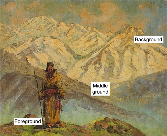
In the work by B C Gue, the woman is in the foreground with the Himalayan mountain range taking up the background. The artist has managed to convey the vastness of the view and magnanimity of the mountains just by the positioning of the figure in the foreground. Notice how the middleground is a bit murky, therefore leading the viewer’s gaze to the foreground and background.
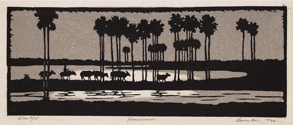
However, in this linocut by Haren Das (below), the middle ground is given the most importance. The animals all walking in a line become the central part of the work and they take up the middleground.
Unlike in painting, where the artist makes a conscious effort in planning out and including ground in their composition, ground is often thought to be a default aspect in photography (especially landscape). However, the photographer too has flexibility in deciding the proportion of each ground as well as which one is to be in particular focus in their work. Sometimes, even with landscapes, the photographer might choose to avoid creating the illusion of depth through more abstract exposures and depths of field. Look at the treatment of foreground, middle ground and background in the photographs below. The main subject may not always be in the foreground.
Both photographs above are classic landscape examples wherein the main focus is actually in the middle ground and background. The foreground simply aids in framing the composition. The terraneous middle ground merges with the background of mountains and skies.
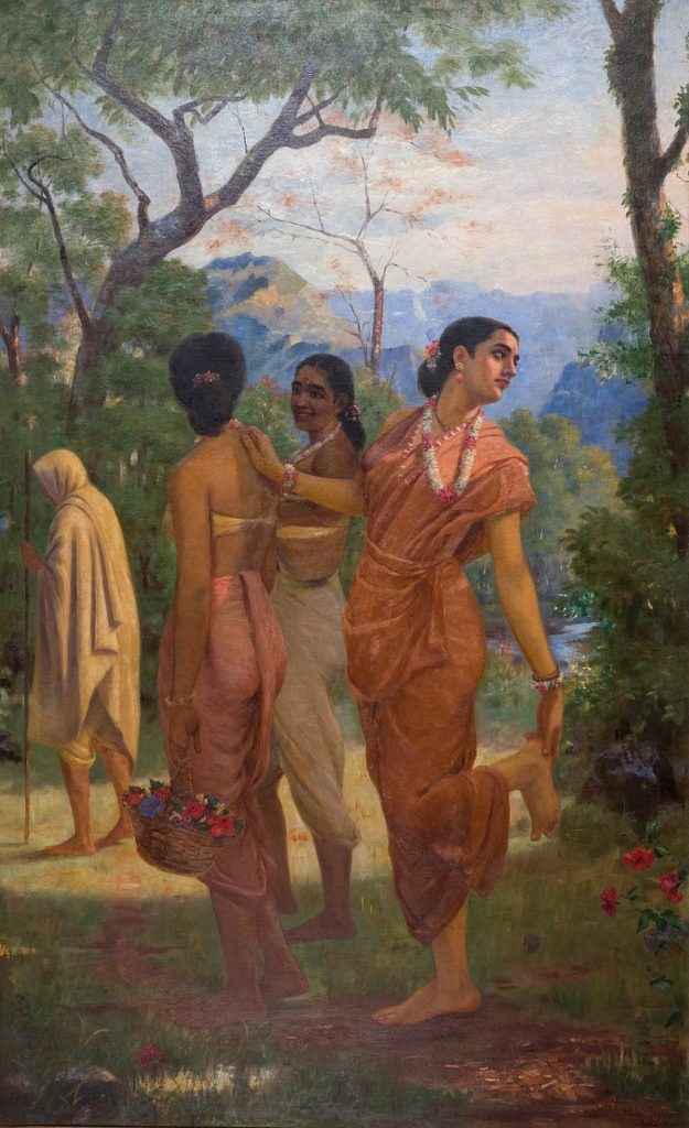
Foreground, middle ground and background are important even for images other than landscapes. In Raja Ravi Varma’s Shakuntala, the foreground is the area where the three women are. The middleground has a hooded figure. The background has trees and a distant mountain. Notice how Ravi Varma’s placement of the women has drawn attention to them, and the background has placed the women in a three-dimensional space.
Raja Ravi Varma, Shakuntala (1870), oil on canvas
(source: Wikimedia Commons).
TRY IT YOURSELF
Identify a landscape that you would like to photograph. Play around with the foreground, middleground and background. Try a few compositions where the foreground is given the most importance. Try the same with the background becoming prominent. Now attempt to make the foreground, middleground and background have equal weight in the picture. Compare your images and look at the different depths created.
Continue reading about space and composition in part three of this series where we will be discussing perspective, rule of thirds and the golden ratio!
