This topic is split into three parts:
Part 1: Introduction to space, positive and negative space
Part 2: Two and three-dimensional space, ground (foreground, middle ground and background)
Part 3: Perspective, rule of thirds, golden ratio
We spend our time everyday existing in this world, in a space that is tangible but also ephemeral. The air that surrounds you, the sky with floating clouds far above, the distant mountain, the line of trees along a street…they all either make or take up space, depending on how you look at it. But what is space? Is it invisible? Visible? Does it surround us? Or do we surround it? This blog will look at space in visual art and the different elements of space to help understand what it really is and how to use space in an effective way for compositions.
What is Space?
Essentially, space refers to depth. This can be real or represented, three-dimensional, or just a general surface area. In a work of art, this space is recreated, so an artist gives a feeling of depth or three dimensions on the picture surface like an illusion. Space in art also refers to the way an artist uses the area of a picture plane- for example, how will you use the space that is a page of your sketchbook or paper? In art, the artwork itself can be three-dimensional (like a sculpture), therefore inserting itself into the same space we are in.
Positive and Negative Space
One of the first things to understand about space is positive space and negative space. Positive space is the space occupied by the primary objects in a work of art. Negative space is the space or area that surrounds these objects or the positive space. Let’s try and understand these terms through an example.

The most pertinent example of understanding positive and negative space is Rubin’s Vase. The three panels above all show the same composition but with different areas of space coloured black and white. This simple task highlights the differences in positive and negative space. What do you see? A vase? Two faces? Both?
Now, Rubin’s vase as indicated in the title is the positive space of the vase. The negative space around the vase is two side-profile silhouettes- which can become the positive space, depending on how one chooses to look at. Maybe then the work would be titled Rubin’s Faces? The relationship between positive and negative space is extremely important. The way it is looked at and proportioned can help define the entire composition of a work of art.
Let’s look at another example. In Three Girls by Amrita Sher-Gil, the three girls are the main subjects of the painting. They make up the positive space in the composition. The area surrounding the three girls that has their shadows is the negative space.

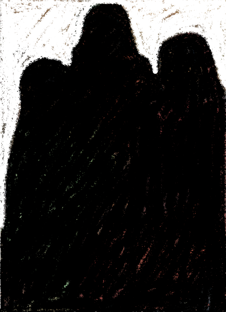
(Source: Wikimedia Commons)
In this painting, the positive space occupied by the three girls (coloured black) makes up the majority of the canvas. Sher Gil has rendered the negative space (coloured white) rather flat and minimal, in order to retain the focus on the primary subjects in the positive space. This careful construction between positive and negative space helps create a tight composition where the viewer is not given any room to wander away from the main subjects.
The above example probably tells us that negative space is as important as the positive space in any composition. Minimal negative space like in Sher Gil’s painting, helps us focus on the subject at hand that occupies the positive space. On the other hand, when the negative space overpowers the positive space, it sets out a different message. Look at the photographs below, where the negative space dominates the frame:
TRY IT YOURSELF
Take a photo of a group of objects in black and white. Try playing around with the proportion between the positive and negative space. What happens when the objects occupy a large portion of the frame? What happens if the negative space is more prominent than the set of objects? Which kind of composition serves your purpose?
Many famous brands make use of the positive-negative space relationship effectively in their logos. In some cases, the negative space simply flows into the positive (like in the WWF logo) while in other cases, an enclosed negative space seems to convey a hidden message (like in the FedEx logo – a hidden arrow between the E and the X).
(Logo sources: WWF – Wikimedia Commons, FedEx – Just Creative)
Try and identify positive and negative space in every work of art – a paining, a photograph, a movie frame or design piece. Notice the balance and imbalance the relationship between the two creates. Continue on to the second part of this series to read more about space!