This topic is split into three parts:
Part 1: Introduction to colour and the colour wheel
Part 2: Colour schemes in art and photography
Part 3: Value, contrast, saturation and temperature
Colour plays an important role in our daily lives, no matter our professions. It reflects individual aesthetic sense and can say a lot about personality–for example, if someone is wearing a sunshine yellow dress, we might assume that the person is cheerful and warm. We also subconsciously react to a space, an artwork or an object because of its colour, and it can have an impact on our mood. For example, if we walk into a room that has soft blues and greens as decor, it might make us take a deep breath, feel calm and reflect on our day. So there we have it–colour weaves its way into our everyday narratives.
Now, if general daily lives are influenced by colour, how much do you think colour plays a role in the life of a visual practitioner? (Hint: more than you can imagine!) Conscious and unconscious colour choices are made all the time. Colour often helps set the mood for visuals; in photography, for instance, compositions can be framed around using specific colour combinations that set the tone of a photograph. Ultimately, colour is a tool that helps give strength to the final message of what a photograph or artwork stands for.
What is colour?
We’ve spoken so much about colour–but essentially, what is colour? Simply put, colour is the amount of reflected light we see. Light contains different wavelengths and it is these reflected wavelengths that our eyes and brains perceive as a whole range of colours. Think of the rainbow and the different colours we see brushed across the sky. Think of sunlight shining through a canopy of trees in a forest and how that brings forth dancing shades of green, yellow and brown. Think of the clothes piled in your wardrobe. The result is always the same. So. Many. Colours.
The more technical term for colour is ‘hue’. Though often used interchangeably, what is the difference between colour and hue? Hue is considered a pure pigment or the dominant colour family. A hue does not have white, black or grey mixed in it. For example, if burgundy is the colour, the hue is red. If navy is the colour, blue is the hue. Got it?
Generally, there are two concepts in colour theory: RGB (Red, Green, Blue) and RYB (Red,Yellow, Blue). RGB allows for a broader range of colour mixing than RYB and it is also the way in which our digital cameras capture light. RYB is mostly used to describe paint and artwork, but to understand how to train the eye, we think that understanding the fundamentals of RYB can really help improve skill in photography. So for this blog post, we are focusing on RYB colour theory and not RGB, but if you want to know more about RGB concepts and technicalities, check out this link. And here’s a good RGB example for you:
Colour Orders
Before getting into colour schemes (the fun part!), we need to understand colour orders. Colour order is the order in which colours are derived. Sounds simple yet confusing? Let’s break it down.
The RYB colour scheme is made up of three colours: Red, Yellow and Blue. These form our primary colours. In other words, they are the “pure” colours from which all other colours are derived. Other colours in the RYB scheme are made up of different mixtures of Red, Yellow and Blue. These colours might be mixed in equal proportions (50-50) or in disproportions (80-20), and it is the different mixes that make for a fun and wide range of colours.
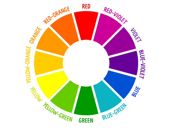
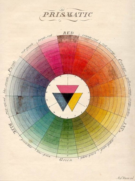
The easiest way to understand the essentials of colour order is to look at the colour wheel. Can you spot Red, Yellow and Blue? What about Violet, Green and Orange? And then there are some more colours like Red-Violet, Blue-Green and Yellow-Orange! Spotted these too? Let’s break it down in steps so as to simply understand the Colour Wheel, and in turn colour orders.
Primary colours
These are the three “pure” colours on the wheel. In the RYB colour scheme, the primary colours are Red, Yellow and Blue. All other colours in this scheme are derived from these colours.

Here are a couple of popular logos that make use of this colour palette. You may have seen the RYB colours used commonly in logos relating to children’s products as they give the feeling of being the basic building blocks of all other colours, just like in that of Toy Story.
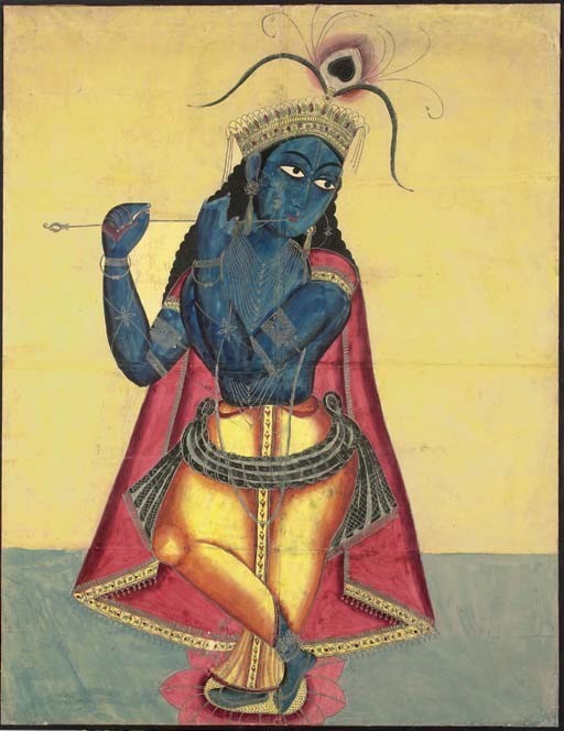
Look at this Kalighat painting of the god Krishna with his flute from 19th century Kolkata, India. The composition makes use of the three RYB primary colours. Krishna’s skin is blue and this is contrasted by the yellow of his dhoti. A red cape falls behind him. This is an instance where the main subject of a painting (in this Kalighat painting, the main subject is Krishna) is rendered in primary colours to remain the focal point.
The photo by Zahra Amiruddin is the perfect example of the use of RYB primary colours. Even though the red and blue are more prominent than the yellow, the subtlety in the yellow brings out the blue dress the girl is wearing and the red frame of the image.
Secondary colours
These colours are formed when two primary colours are mixed to result in the Secondary Colours of Orange, Violet and Green. This can be broken down as follows:
- Red + Yellow = Orange
- Yellow + Blue = Green
- Blue + Red = Violet
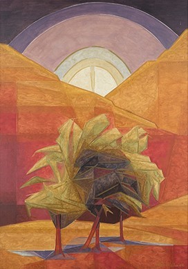
This landscape by Jehangir Sabavala makes use of all three secondary colours: Orange, Green and Violet. Sabavala’s paintings are known to have an almost ethereal glow–this can be seen in the orange that blankets the composition, not in a flat and plane sense, but rather as a more fragmented reality. The way Sabavala has entwined the three secondary colours brings out a certain mood of lyricism and serenity. Depending on the way these three colours are combined, different moods can be achieved.
The photo by Hashim Badani is an example of a way in which to incorporate a secondary colour order into visual practice. Look closely at the way in which the three colours interact and their overall effect through reflections.
Secondary colours are not always the most commonly used palette. It is definitely one of the more unique ones. Often, they are used with other primary colours or just in pairs. Depending on what the visual message is, choose the final colour palette.
Tertiary colours
These colours are the result of mixing a primary colour with the secondary colour next to it on the colour wheel. There are six tertiary colours in total (see the colour wheel) and they are slight variations of the primary and secondary colours, expanding the colour families. The following are some tertiary colours in the RYB colour scheme:
- Red (primary) + Violet (secondary) = Red Violet
- Yellow (primary) + Orange (secondary) = Yellow Orange
- Blue (primary) + Green (secondary) = Blue Green
It is difficult to say that a certain artwork makes use of tertiary colours alone, but it is good to know how these colours are derived. Try mixing paints, oil pastels, or even coloured lights if you have, and try to understand how specific colours are formed!
We have gone over the basic colour orders of the RYB colour scheme. In the next post (Colour: Part 2), we will look at some specific colour schemes with examples in painting and photography. Stay tuned!