This topic is split into three parts:
Part 1: Introduction to colour and the colour wheel
Part 2: Colour schemes in art and photography
Part 3: Value, contrast, saturation and temperature
Colour Schemes
Now that we’ve looked at colour orders, let’s look at (arguably the more fun part) colour schemes! In part 1 of this blog post, we spoke about how we are subconsciously involved with picking colour schemes almost everyday: in our clothes, homes and sometimes even food arrangements. Now it’s time to understand these colour schemes, so we can make conscious choices in choosing colour for photography and other visual practices, or be able to recognise and appreciate them.
The most popular colour schemes from the RYB wheel that we will explore in this blog post are:
1. Complementary
2. monochrome
3. analogous
Colour schemes are grouped based on the colour’s position on the wheel. Let’s bring back the colour wheel again to make things easier.
1. Complementary colours
Complementary colours are the pairs of colours opposite each other on the colour wheel, like red and green, blue and orange, or violet and yellow. These combinations are not what we usually think of; in fact, we probably associate these combinations with being strange and unusual. But in reality, complementary colours work extremely well together when used appropriately, and this is where understanding colour theory comes in handy. Examples of popular complementary colour usage can be found in the logos of Fanta (blue and orange), Lakers (purple and yellow) and Mountain Dew (red and green)!


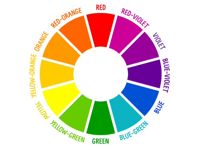
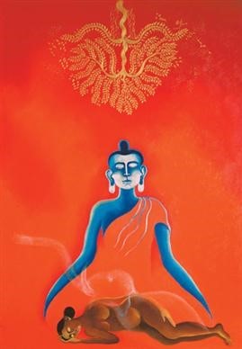
There are also many artists who make use of complementary colour schemes in their work like Arpana Caur, Gopal Deuskar and Tyeb Mehta featured here. Both Maya’s Dream by Arpana Caur and Maharashtrian Lady by Deuskar are fine examples of using the orange and blue pair in different yet striking ways.
While most of the painting is dominated by a bright orange, Caur manages to draw attention to the central Buddha figure by using a complementing blue. The contrast achieved in terms of colour aesthetic is definitely striking and impactful.
Arpana Caur, Maya’s Dream (2004), acrylic on canvas. (Source: Saffronart) 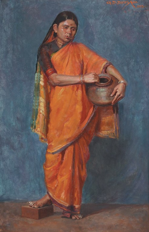
Gopal Deuskar, Untitled (Maharashtrian Lady) (1929), oil on paper. (Source: DAG) 
Tyeb Mehta, Mahishasura (1994), acrylic on canvas. (Source: Christies)
On the other hand, Deuskar’s usage of the blue and orange pallete creates a different mood because of the more subdued tones. Here, the background and subject colours are reversed. By using a warm orange for the lady’s saree, Deuskar retains focus on her. The textured blue background simply aids in pushing the subject forward while creating an interesting contrast.
Another pair of complementary colours, red and green, is seen in Tyeb Mehta’s Mahishasura. The two central figures of the composition stand against one another, not only in stance but in terms of their complements in colour.
Need help in thinking of ways to make compositions pop or making subjects stand out against one another? Complementary colours are the answer. Just like in the above photograph by Sujatro Ghosh, the high contrast of these colour combinations, irrespective of the tone, help in making the composition lively.
ACTIVITY: OUT OF THE BLUE
Now, out of the blue usually refers to something shocking and surprising. We want you to use the complementary scheme of blue and orange and take photographs that are surprising and shocking, or in other words “out of the blue”. Look at Sujatro Ghosh’s photo for inspiration, but try and make yours more shocking.
2. Monochrome
When we think monochrome, we might automatically think black and white. However, monochrome, in its definition, does not only relate to black and white. Monochrome actually means single colour. But for visual interest, let’s look instead at monochrome being all the values under a certain colour. Some popular logos that make use of this colour scheme are PayPal and Adidas! Can you think of some more?


While we will not get into the details of what is value just now, just understand that value denotes the lightness or darkness of a single colour (more on this in Colour: Part 3). So monochromatic compositions have one dominant hue from the RYB scheme with different values of that same colour. Think of the ocean in Maldives for example–all shades of blue! That’s a monochrome shot for you.
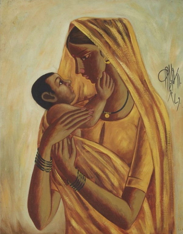
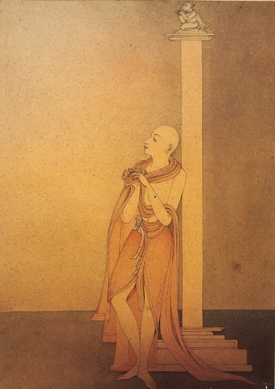
In both Prabha’s and Majumdar’s work, a predominantly monochromatic palette is used. Prabha’s woman and the baby are rendered in different values of ochre (a kind of golden brown), while Majumdar’s is a similar saffron. Even though the paintings technically use only one colour, notice how the different lightness and darkness in the colours used make the entire composition compelling to look at. The particular tints and shades used in these works create a calming effect that is suited to both subject matters.
ACTIVITY: MONOCHROME
Try shining a light on a single coloured piece of cloth. Notice the different tints and shades created of the colour. Try and capture this monochromatic palette with your camera! Look at the photo by Hashim Badani below. Play around with light and cloth in the same way. You can even try using different textures and different coloured lights.
3. Analogous
Colours (usually a set of three) right next to each other on the colour wheel are called analogous colours. They usually are derived from the same colour, most often a primary colour or the neighbouring secondary colour.
Analogous colours are found in nature; for example, seasons like Autumn present analogous colours like orange, yellow-orange and yellow. It’s useful to understand the mood analogous colours can create for visual compositions. Usually landscapes make these colour schemes shine. Otherwise, having analogous colours in the background can bring a particular object into focus. And lastly, analogous colours also help in creating a serene and melancholic mood.
BP and Mastercard are two popular logos that make use of this colour scheme.


The difference between analogous and monochromatic colour scheme is that while monochrome includes a single colour along with its tints and shades, an analogous palette consists of three separate colours along with their tints and shades. Since these three colours are next to each other on the colour wheel, they seem to allow a wider range of colours while being similar to each other.
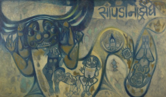
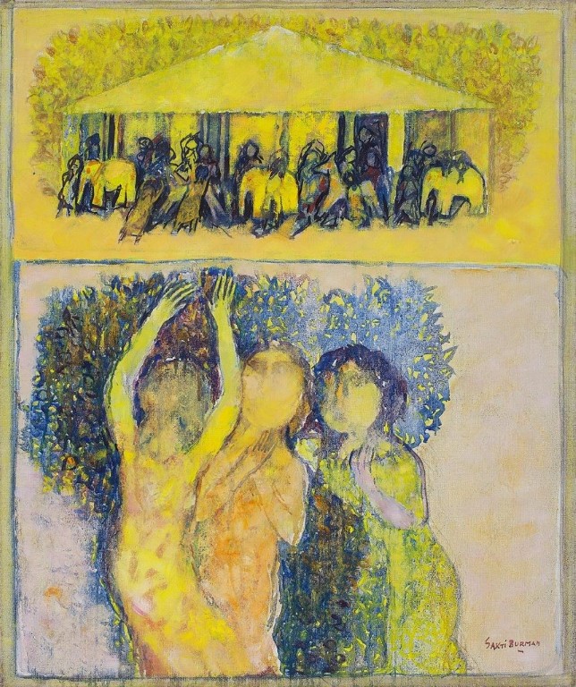
We can all agree that Sultan Ali’s Krodth, though it makes use of more than three colours, is a fine example for the analogous palette consisting of blue, blue-green, yellow and yellow-green. The work below by Sakti Burman also makes use of similar colours but in varying intensity and proportions. Notice the difference in mood the two paintings evoke, despite employing the same colour family.
For an idea of an analogous colour palette in photography, look at the works of Madhavan Palanisamy and Kowshik Vasudevan. Palanisamy’s rose is bright and saturated (hold onto this word, we’ll get to it soon) while Vasudevan’s sunrise is serene with the colours blending into one another.
We have gone over the basics of colour theory and colour schemes over the last two blog posts. This should help in enhancing visual practice and appreciation, across all visual art practices. As a creator, always think about what it is that the visual should convey–and working around that, incorporate colour schemes, modes and temperatures. More on this in Colour: Part 3!