This topic is split into three parts:
Part 1: Introduction to colour and the colour wheel
Part 2: Colour schemes in art and photography
Part 3: Value, contrast, saturation and temperature
In the first two parts of this blog series, we spoke a lot about colour and the colour wheel, as well as colour schemes in art and photography. Now let’s take a look at more aspects related to colour: value, contrast, saturation and temperature.
Value: Tints and Shades
Simply put, value refers to the lightness or darkness of a colour. This leads to two kinds of values: tints and shades.
- White is the lightest value of any colour; when white is added to a colour, it is called a tint.
- Black is the darkest value of any colour; when black is added to a colour, it is called a shade.
- When grey (both black and white) is added to a colour, it creates tones. (More on this under Saturation!)
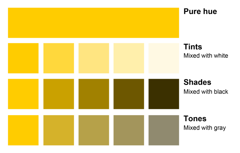
We’ve explained what ‘hue’ means in Part 1 of this colour series. In case you missed it, now’s a good time to revisit it: Hue is considered a pure pigment or the dominant colour family. A hue does not have white, black or grey mixed in it. For example, if burgundy is the colour, the hue is red. If navy is the colour, blue is the hue. Got it? The above image helps us understand clearly what each of these terms mean: hue, tints, shades and tones.
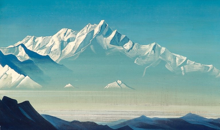
Notice the range of tints and shades, from white to black, of a single hue, blue, in the painting of the Himalayas by Roerich. A similar kind of value scale can also be found these photographs by Vijay Sarathy.
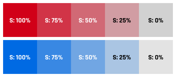
Contrast: High and Low
The ratio between whites and blacks (light tints and dark shades) is called the contrast of a visual. In that sense there can be two types of contrasts: high contrast and low contrast.
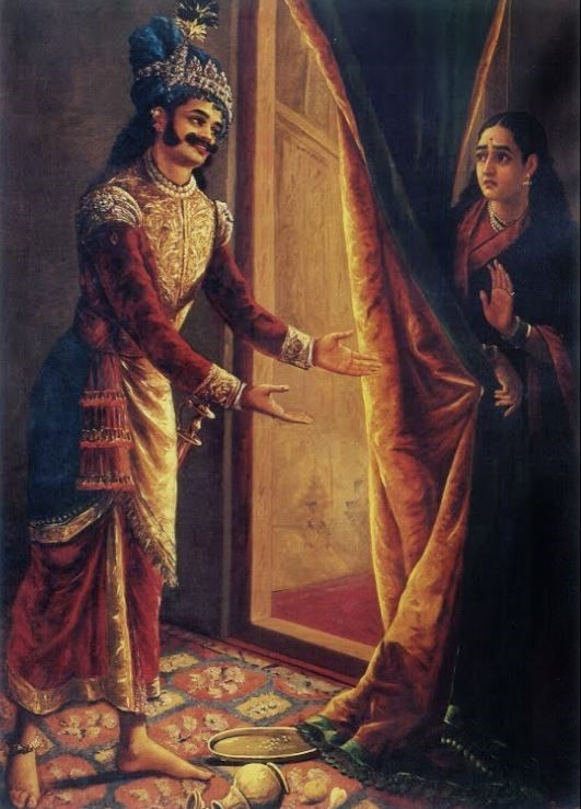
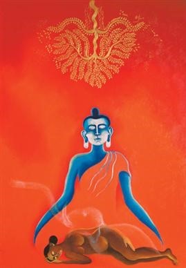
High contrast is when the visual has a full range of tones, sometimes ranging from the whitest white to the blackest black. In other words, high contrast images have several highlights and shadows and can be quite dramatic. Notice the difference between the blackest black and the whitest white in this painting by Raja Ravi Varma. A similar high contrast tonal scale can be found in the photograph by Nachiket Pimprikar below.
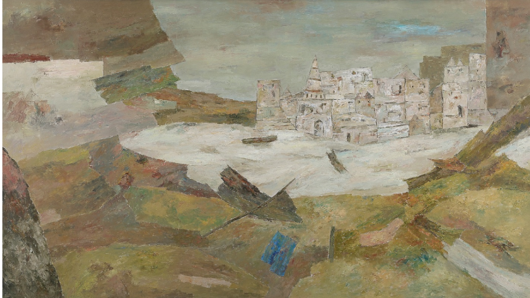
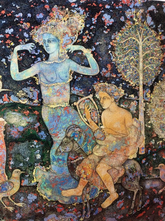
Low contrast visuals have a smaller and shallower range of tones. The differences between the shadows and highlights is not so much with the entire range being more flat than dramatic, like in the painting by Ram Kumar and photograph by Vijay Sarathy below. The final effect created is muted, neutral or even pastel.
Saturation
Most often, when we think of saturation in colour, we are actually thinking of the intensity of that colour. In other words, saturation measures the purity of a colour. A heavily saturated colour has very little grey added to it, while a less saturated colour has a lot of grey added to it. Since the degree of saturation depends on the amount of grey (black and white) added to the hue, a completely desaturated image will be in grey scale or black and white.
You can alter the saturation of your photo depending on the mood you want to create. If you want your photo to scream with colour, use extremely saturated hues. And if you want a calming effect, desaturate your colours to have a more serene effect.
Colours can be made less saturated by mixing them with their corresponding opposing colours on the colour wheel, in other words their complements. Remember we spoke about complementary colours like red and green, blue and orange, and yellow and violet? If red and green are mixed, a “neutral” colour is formed- it will look like a grey or brown (feeling adventurous? Take out your colour and try mixing complements to get neutral colours!).
We mentioned in the previous blog post on colour schemes that complementary colours seem to jump out of the page due to their contrasting nature. Look at Arpana Caur’s Maya’s Dream (left image) which we spoke about in Colour: Part 2. This is an example of a highly saturated artwork where the colours are in their “purest” form. Now look at Sakti Burman’s work (detail – right image). This shows the same blue and orange complements, but less saturated. Observe the difference in the kind of mood they create and the message the colours seem to convey.
Colour Temperature: Warm and Cool
The colour wheel appears to have a warm side and a cool side. The warm side is made up of the colours like yellow, orange, red and their associates while the cool side comprises blue, green and violet.
Warm colours are embracing, and also indicative of activity, energy and light. Cool colours reflect calmness and a soothing atmosphere. Warm and cool colours can be used separately or even in combination with one another to create certain moods, and illusions of advancing and receding.

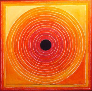
Colour temperature can be clearly understood when looking at the paintings of S H Raza. While he is known for his geometric shapes, the use of warm and cool colours by him creates a range of moods for his paintings. The same geometric shapes, when painted in either warm or cool hues, have such different results! In Nari (centre image), the use of blues and greens indicates the use of a cool colour scheme. The entire painting is soothing and speaks of calmness and serenity. Meanwhile, in Aarakta Shyam (left image), Raza uses a warm colour palette. The oranges and yellows burst out from the canvas, creating a vibrating, frenzied and active canvas. In Panch Tatva (right image), he uses a combination of the warm and cool palette, creating a complementary balance (blues and oranges), that helps convey the painting’s symbolic concept of the five elements of earth.
Look at the above two photographic examples. How would it have looked if the colour temperatures were reversed? What message would the photographs then deliver?
Warm and cool colours have extremely important uses in compositions. Think about the final message of the visual, and then decide which colour scheme might be best suited for it. Sometimes, as creators, we might be able to artificially recreate a desired temperature using filters, lights or post-processing; but some other times, the naturally existing temperature at a certain time of day or location becomes the driving force behind the final visual.
We looked at many aspects regarding colour in this three-part blog post: the colour wheel, colour orders, colour harmonies and some more basic terms associated with colour. We hope this theoretical knowledge will make you more aware and help your creative journey whether it is for practice or appreciation. Painting, photography, design–whatever is the medium of your visual language–the building blocks remain the same. More #NotesonVisualLanguage coming your way!